Our Y: Introducing the new Yoco 🚀

3rd June 2021

Why did we refresh the Yoco brand?

You might have noticed a few changes in how we look. Here’s Y.

Six years on, 140 000 small businesses now make up our rapidly growing nationwide community. We believe there is nothing small about small business and with this, we wanted our brand to reflect more of our customers. 

Back to our Y

The refresh is symbolic of our connection with our mission – the reason why we exist. We exist to enable you to thrive.

The businesses in our community are vibrant, passionate and move things forward. As we keep building for the future, we want to make sure that we look and feel like a part of this community.

We believe in breaking down barriers for small business.

And this is just the start.

Just over a year ago, we stepped back and looked at all the work Yoco has done so far. We decided that our brand didn’t match our personality, or our mission. We strive to be brave, bold, and authentic. We like to keep it simple. But our look and feel didn’t match the Yoco experience. So we started the process of change and we’re finally ready to share it with you.

So welcome to Yoco, again.

What will change? 

Everything. From logos to fonts, photography and colours, we will look completely different. Explore the changes on our website, Yoco App, and Portal. What won’t change are our products, and experience. Inside, it is still the same, even a little better.

Meet the new Yoco Logo 

The brand refresh started with our logo. Through extensive customer research, we learnt that our customers loved our logo so we didn’t want to change too much. What we did want was a logo that felt more bold, and classic. A logo that could scale as we did, and a logo that would be more flexible. yoco-logo-transformation

Bolder, Brighter, more African

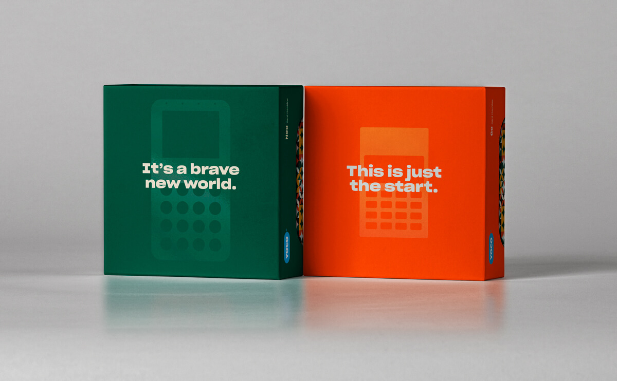
The next biggest change is our brand colour palette. Like so much at Yoco, it began with a Slack message. Some of the feedback from our customers told us that our old colour palette felt too safe and European. 

The new colour palette was led by our design principles: we strive to be bold, human, and African. To complement our electric Yoco blue, we chose a palette that felt more natural and earthy. 

The new Yoco colour palette takes strides away from the blue world of financial services. Its distinct African aesthetic helps our look match our mission.


yoco-colour-palette

The new Yoco brand is all about flexibility and growth.

What we have now is only the first stage of expression. As we continue to explore, it will evolve.

Another important aspect of our colour design was ensuring accessibility. The new Yoco colour palette underwent a lot of contrast testing to make sure that content would be legible for anyone who had a vision impairment. 

Styling our font

Part of the reason for the refresh was that we needed to give the Yoco brand more freedom and diversity. The new font – Sharp Grotesk – gives our brand a unique personality. Its variety of widths and weights enable us to create striking communications that still feel cohesive. 

Signed, Sealed, Delivered – our new boxes

The new packaging design was led by user experience. The goal was to create an Instagrammable moment of delight when customers received and opened their box. 

We wanted to avoid marketing repetition and tap into the emotional experience of seeing your card machine for the first time – it is the start of a new way of doing business.  

Through our research, we also learnt that many customers kept their card machine boxes in display or for storage. So, the new designs also improve functionality making them easier to open, close, and keep. 

Connecting the dots between brand and product

The brand refresh extends into Yoco’s website and product experience. From the moment users begin their journey with us, on the Yoco website, to when they become customers, we want their connection with the Yoco brand to intensify. The Yoco product experience mirrors our brand design principles. 

The biggest change for the website was usability. We wanted it to be more than a facelift. As a brand that is human-centred, our website needed to deliver the same promise. The new website strikes the balance between accessible and aspirational. And now we really represent the 140 000 businesses that rely on us to grow their businesses and get paid.

Why look like the past, when we're building the future?

The brand refresh was led by Yoco’s Senior Brand Designer, Elton Dick, and created almost entirely by Yoco’s internal marketing team – an immense feat for any startup.

The end product of the refresh is a brand that truly represents us: our personality, our tone of voice, our charisma, our warmth, and our pride as a South African startup. We are no longer absorbed in a sea of sameness. 

The refresh is my biggest project to date, and it was a privilege to be able to impact the Yoco brand in such a meaningful way. We wanted the refresh to be an opportunity for us to get closer to our customers, and for this reason, we felt that it was important that the internal team tackle the refresh. What we've built is a foundation on which to grow the brand significantly into the future. The process of a redesign can be a lonely road to walk – for a year I was extracted from the day-to-day work of the team to focus on this project – but seeing it come to life makes it worth it.