
Humans are inherently visually-driven creatures. We’ve been relying on our sight to convey critical information to help us identify predators, find sources of food, and choose places of shelter since the dawn of time. And in 2020, we rely on visual cues to guide us when making online purchases. As marketing guru Neil Patel reminds us, “shopping is the art of persuasion” – and the role of colour psychology in e-commerce is a crucial one.
Online, there’s only one sense at play, which means that the colours you choose aren’t just a matter of taste, they’re the difference between a visitor and a customer.
Not convinced? Consider the following: all it takes is 90 seconds for someone to evaluate your brand, and up to 90% of that snap judgement is based on colour alone. What’s more, a major 85% of online shoppers cite the colour of a brand as the reason for their purchase.
To ensure you’re optimising the use of colours in your e-commerce store, you need to be familiar with colour psychology.
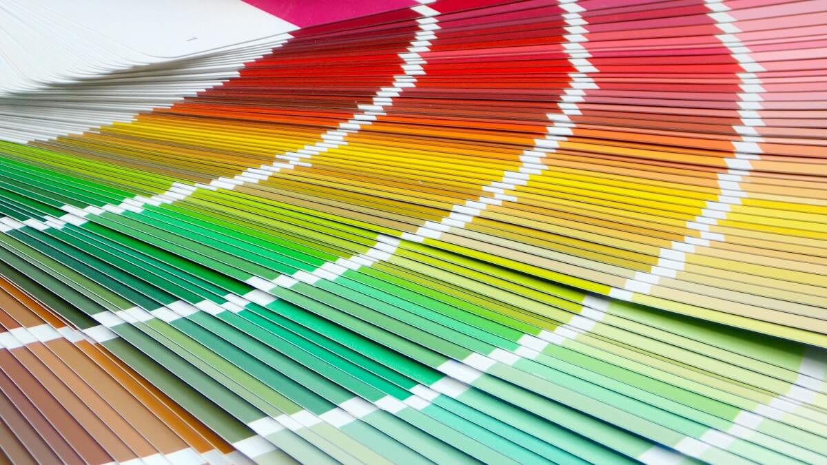
Wikipedia defines colour psychology as “the study of hues as a determinant of human behaviour”. In other words, the correlation between certain colours and certain emotions, which in turn, encourage certain actions. Think of the last “for sale” sign you saw (online or off). Chances are, it was in red. This isn’t a coincidence; it’s a deliberate use of colour to convey the right emotion (in this case, a sense of urgency). When inbound marketing software giant Hubspot conducted an A/B test using two different call to action buttons – one red and one green – they found that red outperformed green by 21%. And in a highly competitive market where purse strings are being pulled tighter and tighter (thanks Covid-19!), every single click counts.
Some of the typical emotional connotations in colour psychology:
Black = power, stability, intelligence – example: Apple
Blue = peace, tranquillity, security – example: Standard Bank, Yoco
Purple = royalty, wisdom, respect, luxurious – example: Cadbury
Yellow = openness, activity, fun – example: Snapchat
Orange = friendliness, cheapness, excitement – example: Fanta
A note on the colour-emotion connection:
A colour that signifies a specific emotion in one country or culture may not necessarily translate across borders. For example, while yellow is typically associated with lightheartedness and fun, in Germany, it signifies envy. (The German equivalent of “Green with envy” is “Gelb vor Neid” – or “Yellow with envy”.)
To make sure you’re optimising the use of colour psychology in your online store, here’s what you need to consider:
1. Who are my customers?
As with anything to do with e-commerce, the most important consideration when it comes to deciding on a colour scheme is your target market. Differing demographic factors like age and gender mean that what resonates with one group of people, may fall flat with another. Consider the phenomenon that is millennial pink: a pastel pinky-peach that has been proven to reduce stress and aggression. It makes sense then, that it was adopted by multiple brands catering to a generation that faces crippling debt and inflated living costs. While embraced with fervour by millennial-focused brands, it was largely ignored by those that cater to an older customer base.
2. What do I want my brand to be associated with?
Take some time to think about the emotions you want to evoke in visitors to your online store. Do you want to excite them? Instil a sense of calm? Convey trustworthiness? For example, local health store Wellness Warehouse uses green, a colour reminiscent of flourishing vegetation and symbolising nature – associations that are on par with the offering. They also use pastels, which are linked to peace and tranquillity. On the other end of the spectrum, local coffee company Vida e Caffe successfully uses red to signify the vibrancy and energy that are synonymous with the brand. As soon as you click on either site, you instantly know what to expect from the brand in question.
3. Which colours facilitate sales?
Choosing the colour palette of your online store is a balancing act between finding the colours that evoke the right emotions in your visitors, and identifying the colours that will persuade them to click on a call to action and hit that all-important ‘checkout’ button.
Ideally, you need to choose colours that convey your brand’s personality, without detracting from a streamlined UX. While you might fall in love with a particular colour combination, if it’s distracting to visitors, your efforts will be in vain. (We’re not the kind to name and shame, so if you want some examples of why colour can make or break the user experience of your website, head on over to this article for some hair-raising samples.) If you’re feeling overwhelmed, remember this:
The most considered and visually-appealing website is useless if the product or service it’s selling is sub-par.
Choosing the right colour scheme for your online store can feel daunting. The good news is, there are no hard and fast rules here, and the beauty of e-commerce entrepreneurship is that if something isn’t working, you can change it! Conduct some A/B tests, have a gander at your competitors (after all, if you want to beat them, you have to know what they’re up to in the first place), and play around with colour wheels. But don’t lose sight of the most important task at hand: perfecting the thing that matters the most, which is your product or service.